Build pages more people can use
Accessible Web Design: Better for Everyone, Not a Niche Feature
Practical accessibility improvements for contrast, keyboards, screen readers, forms, media, motion, and plain language.
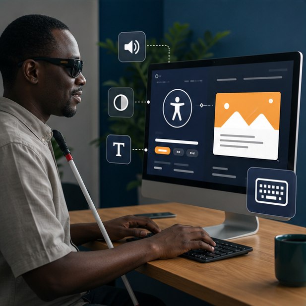
Start with semantic HTML, keyboard access, visible focus, strong contrast, useful alternative text, labeled forms, captions, flexible text, and clear error messages. These practices improve usability for disabled people and many everyday mobile situations.
The short version
What you will take away
Use native semantic elements before adding ARIA.
Make every action available by keyboard.
Do not communicate meaning with color alone.
Test with people and assistive technology—not only automated scores.
Build a meaningful document structure
Headings, landmarks, lists, buttons, links, tables, and form labels give assistive technology a reliable map. A clickable div styled like a button does not provide the same behavior.
Support keyboard and visible focus
People may use keyboards, switches, voice control, or alternative devices. Every interactive element should be reachable in a sensible order, clearly focused, and usable without precise pointer movement.
Design readable visual and media content
Strong contrast, flexible text, calm motion, captions, transcripts, and meaningful alternative text help users with visual, hearing, cognitive, or motion needs—and improve use in bright light or noisy places.
Test beyond the checklist
Automated tools find only part of the problem. Use keyboard-only navigation, zoom, screen-reader spot checks, mobile reflow, and feedback from disabled users when possible.
Your action checklist
Useful primary references
Turn the idea into action
Want a website that welcomes more people?
We can review the core journeys and build accessibility into the design system.
Request a quoteJengaSites Editorial
Practical website guidance for Kenyan businesses and organisations.