Design for the screen people actually use
Mobile-First Web Design for Kenyan Customers
Build pages that remain fast, clear, and easy to act on across common Android devices, mobile data, and small screens.
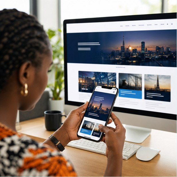
Mobile-first means prioritizing the essential content and action for a narrow, slower context before expanding the layout for larger screens. It is a content and performance decision—not only responsive CSS.
The short version
What you will take away
Put the main answer and action high on the page.
Keep tap targets generous and forms short.
Optimize media before it reaches the browser.
Test on real devices and constrained networks.
Prioritize before you decorate
A small screen exposes weak hierarchy. Lead with the promise, essential proof, and next action, then let visitors reveal detail as they need it. Desktop leftovers should not dictate the mobile order.
Design for thumbs and keyboards
Controls need enough size and spacing, while forms should use the right input types and avoid fields that do not change the response. Phone, map, and WhatsApp actions should work directly.
Respect mobile data and device limits
Large hero videos, multiple font files, third-party widgets, and uncompressed images can make a polished page unusable. Every kilobyte and script should earn its place.
Test outside the design studio
Browser resizing is useful, but it does not reveal slow networks, mobile keyboards, touch behavior, battery limits, or browser variations. Test real customer tasks on real phones.
Your action checklist
Useful primary references
Turn the idea into action
Need a website built for mobile reality?
JengaSites designs the phone experience first, then scales it into a strong desktop layout.
Request a quoteJengaSites Editorial
Practical website guidance for Kenyan businesses and organisations.